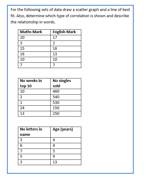
Table of Contents
Unit 1 | Algebra
Page 1 | Expressions and Formulae
Page 3| Solving Linear Equations
Page 4| Expanding and Factorising
Page 5| Factorising Quadratics and expanding double brackets
Page 6| Patterns and Sequences
Page 7| Simultaneous Equations
Page 8| Changing the subject of a Formula
Page 9| Adding , subtracting algebraic formulas
Unit 2 |Graphs
Page 1 | Straight line graphs
Page 2 | Graphs of Quadratic functions
Unit 3 |Geometry and Measure
Page 2 | Symmetry
Page 3 | Coordinates
Page 4 | Perimeter, Area, Volume
Page 6 | Measurement
Page 7 | Trigonometry
Page 8 | Pythagoras
Page 9 | Angles
Page 10 | Shapes
Page 11| Time
Page 12 | Locus
Unit 4 | Numbers
Page 1 | Speed, Distance and time
Page 2 | Rounding and estimating
Page 3 | Ratio and proportion
Page 4 | Factors, Multiples and primes
Page 5 | Powers and roots
Page 7 | Positive and negative numbers
Page 8 | Basic operations
Page 9 | Fractions
Page 10 | Percentages
Unit 5 | Statistics and Probability
Page 1 | Sampling data (MA)
Page 2 | Recording and representing data
Page 3 | Mean median range and mode
Page 4 | Standard deviation
Unit 4 | Calculus
Scatter Graphs
L.O- To be able to draw scatter graphs along with a line of best fit. Also, understand and be able to identify a positive, negative or no correlation shown by graphs.
A scatter graph is a diagram which is used to compare two variables.
Example 1:
Draw a scatter graph using the following results
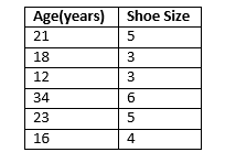
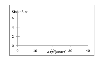
- Label one axis of the graph as Age and the other axis of the graph as Shoe Size. Also, work out the scale of each graph.
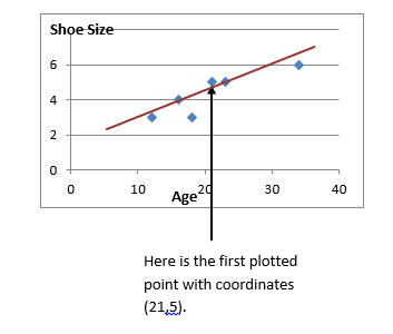
2.Plot the graph. The data is simply used as coordinates
.
Steps:
- Label the two axis of the graph with the two variables. Also work out the scale of each axis using the range of data in each variable.
- Plot the graph! This is very simply as you use the data provided as coordinates.
Draw a line of best fit if possible (sometimes the points will be too scattered and you will not be able to draw a line of best fit).
A line of best fit should go through as many points as possible. There should be approximately the same number of points above and below the line as well.
Correlation
Scatter Diagrams tells us whether there is a relationship between the two variables that have been plotted. The relationship is described as a correlation. A scatter graph may show positive correlation, negative correlation or no correlation.
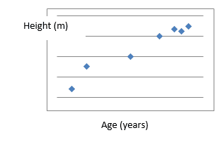
Positive Correlation
This graph tells us that as the age of a person increases, their height also increases. This type of correlation tells you that as one variable increases, the other variable also increases
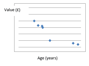
Negative Correlation
This type of correlation tells you that as one variable increases, the other variable decreases.
This graph tells us that as the age of a car increases, its value decreased.
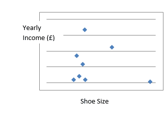
No Correlation
This type of correlation tells you that there is no relationship between the two variables.
This graph tells us that there is not relationship between shoe size and yearly income.
Using the Line of Best Fit
The line of best fit can be used to predict the value of one variable when the other is known.
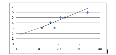
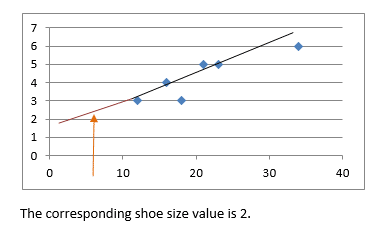
Example 1:
Use this scatter graph and the line of best fit which has already been drawn to predict the shoe size of somebody aged 5.
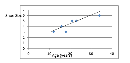
- Extrapolate the line of best fit so that is extends down to age 5.
2.From Age 5 on the x axis ( the value given in the question) , move up until you reach the line of best fit and read off the shoe size value.
Steps:
- Extrapolate the line of best fit as needed so that is extends up/down to the value you are trying to predict.
- From the value you are given in the question move up/across to the line of best fit and read off the corresponding value on the x/y axis.