Table of Contents
Unit 1 | Algebra
Page 1 | Expressions and Formulae
Page 3| Solving Linear Equations
Page 4| Expanding and Factorising
Page 5| Factorising Quadratics and expanding double brackets
Page 6| Patterns and Sequences
Page 7| Simultaneous Equations
Page 8| Changing the subject of a Formula
Page 9| Adding , subtracting algebraic formulas
Unit 2 |Graphs
Page 1 | Straight line graphs
Page 2 | Graphs of Quadratic functions
Unit 3 |Geometry and Measure
Page 2 | Symmetry
Page 3 | Coordinates
Page 4 | Perimeter, Area, Volume
Page 6 | Measurement
Page 7 | Trigonometry
Page 8 | Pythagoras
Page 9 | Angles
Page 10 | Shapes
Page 11| Time
Page 12 | Locus
Unit 4 | Numbers
Page 1 | Speed, Distance and time
Page 2 | Rounding and estimating
Page 3 | Ratio and proportion
Page 4 | Factors, Multiples and primes
Page 5 | Powers and roots
Page 7 | Positive and negative numbers
Page 8 | Basic operations
Page 9 | Fractions
Page 10 | Percentages
Unit 5 | Statistics and Probability
Page 1 | Sampling data (MA)
Page 2 | Recording and representing data
Page 3 | Mean median range and mode
Page 4 | Standard deviation
Unit 4 | Calculus
Charts
- In a bar chart, the height of each bar will represent the number of units, which can be read off the y-axis. Bar charts are used for qualitative data.
Example 1:
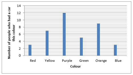
If we look at this chart, we can see that 12 people had a purple car, 3 people had red cars, 7 people had yellow cars etc.
2. A pie chart is used to show the proportion of a specific amount.
Example 2:
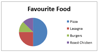
This pie chart shows the favourite foods of 40 people. Using that, we can find out how much each segment represents. For example, pizza represents half of the ‘pie’ so it must be 20 people.
3. Pictograms have a picture which represents a certain number (you can find out what it represents by looking at the key).
Example 3:
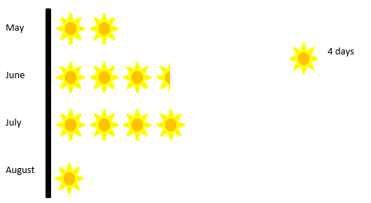
This pictogram tells us how many days in each month it didn’t rain. For example, in May, it didn’t rain on eight days. Why don’t you try to figure out how many days it didn’t rain in the other months?
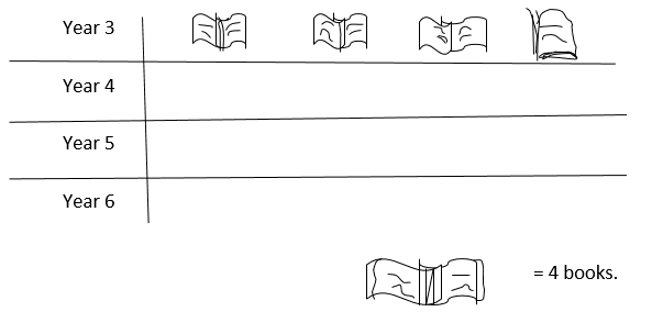
1) Joshela is collecting information about how many books the people in this school have read in the past week. This is a tally chart of the answer – Fill in the frequencies.
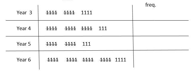
Use the results to complete this pictogram
How many more book did yr6 need than year 5?
2) Bilal’s school is having a survey on what people’s favourite sports are. This is a bar chart of the results
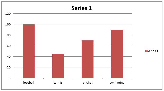
Which is the most popular sport?![]()
How many people took part in the survey?![]()
3)
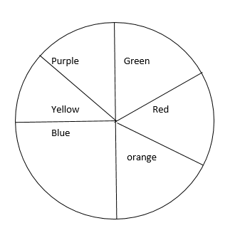
100 children tell us what their favourite colour is
How many children chose purple?
How many children chose red?